

A visually rich music chart app for eMusic, built inside Spotify's desktop platform.
Spotify's App Experiment
Between 2010 and 2012, Spotify's desktop app had a feature that let brands build applications embedded directly inside the player. These ran alongside the music, not in a separate browser window. The feature attracted a range of brands and music services before Spotify deprecated it a couple of years later.
I built multiple Spotify apps while working at We Are Hunted in Melbourne. We consulted to various brands and music experiences, and eMusic was one of our partners.
The Brief
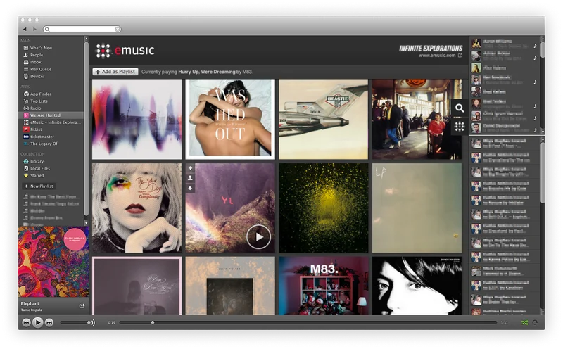
eMusic was one of the earliest digital music stores, founded in 1998, and had carved out a niche as a home for independent music. They wanted a Spotify app that brought their music charts and curation inside the player. The app was called Infinite Explorations.
The design emphasis was on high-resolution artist graphics. This was a visually driven experience where large artist images dominated the interface, making the charts feel more like a magazine than a spreadsheet. We Are Hunted brought the charting data and I handled the front-end build, working closely with eMusic's team on the visual direction.
Building on an Undocumented Platform
The Spotify Apps API had minimal documentation. Building anything beyond a basic prototype meant reverse-engineering parts of the platform, testing undocumented endpoints, and finding workarounds for limitations that weren't written down anywhere. The small community of Spotify app developers shared knowledge informally, but most of the heavy lifting was trial and error.
The apps were single-page applications built before modern front-end frameworks existed. I used HTML, CSS, jQuery, and a custom state management system I'd developed specifically for this platform. After building enough apps to know where the documentation gaps were, I created Foundation, an open-source reference app that gave other developers proper documentation and working examples.
The Visual Challenge
The eMusic app pushed harder on the visual side than any of the other Spotify apps I built. Loading high-resolution artist images inside a desktop application that was already managing audio streaming and UI rendering required careful attention to performance. Images had to load progressively, memory management had to be tight, and transitions between views needed to feel smooth despite the asset sizes. In 2011, this wasn't a solved problem with lazy-loading libraries. It was manual work.
What I Took From It
Spotify deprecated the apps platform in 2014, and Infinite Explorations went with it. eMusic itself went through several ownership changes and pivots over the years. But this project reinforced something I've carried into every product since: the visual quality of an interface directly affects how people perceive the quality of the data behind it. The same music charts presented as a text list versus large, beautiful artist imagery created completely different user experiences. The information was identical. The feeling was not.